
The Challenge was to redevelop the current IVR experience by understanding the needs, goals and frustrations of customers - primarily customers with disabilities so that we can provide an improved, inclusive customer service experience that in the end, better serves everybody.
Customers with store inquires have difficulty utilizing the current automated system (and website) because options are cumbersome, impersonal and incommodious. The challenge is to create a North Star experience that better provides greater solutions to customer needs, attracts new users and maintains retention.
We believe that if we provide users with an accessible and streamlined communication experience that allows for personalized preferences, customers will be more engaged and satisfied.
We know this to be true if we see increased traffic on Home Depot's website and reduced time spent connecting to customer service.
To help Home Depot thrive, I created a more appealing look, redesigned existing web and mobile app pages, created a log in area for a personalized feed, a dashboard for inquiries and various landing pages for different unique purposes/individual needs
UX research, UX and UI design

Initial research focused on better understanding what customers were calling for and how they preferred to be delivered as well as measuring the extent of the current frustrations that needed to be eased.
What are primary contact methods chosen when contacting a retailer for needs?
How often are accessibility features utilized over the phone?
When accessibility is needed, what features are most commonly utilized?
What are top customer inquiries when contact home improvement stores?
A survey was conducted on 18 participants to identify which communication methods and accessibility features people are currently choosing and determine which features are essential in the current IVR system


A series of in-depth interviews were then conducted on 5 participants to further identify pain points, frustrations, needs, and desires with existing products to determine how YUM could improve this experience.


All participants used a combination of multiple apps to find, save and share restaurants
Users value the ability to customize their settings to curate things that fit their preferences
Major products in the market lack desirable features and feel impersonal, outdated and untrustworthy
A map feature with tags is paramount when searching for restaurants
Too much information on screen makes users feel overwhelmed, they'd like a more curated experience
Irrelevant suggestions feel impersonal and clutter the UI, filters are highly used tools when searching
Competitive analysis was conducted to identify competitor's strengths and weaknesses to inform YUM's features and information structure.

After conducting user interviews, all the participants responses were synthesized to identity themes, opportunities, and features that The Home Depot IVR system could focus and improve upon.
An affinity map was created to identify high level themes and group similar insights gained from the user interviews.

Using the four hues of the SimpleStage identity as a starting point, I expanded the color palette to accommodate the needs of the platform’s complex dashboard system.

Two personas were built based on the data collected to help drive decision making and keep the product focused on solving users pain points, frustrations, and goals.

To kick-off the design process, quick sketches helped me get ideas on paper to establish which elements were necessary for each screen. A low fidelity prototype was then created for initial user testing.
The primary user flow is the process of searching, saving and sharing with friends.

YUM's simple information structure makes it easy to navigate and move through tasks.

Rough sketches were done to get my initial thoughts on paper and brainstorm new ideas for specific UI elements.


Using the feedback and insights gained from research, analysis and sketching, a how-fidelity prototype was created to begin user testing.

A usability study was conducted to determine where improvements could be made and identify new ideas to satisfy user expectations, needs, and desires.
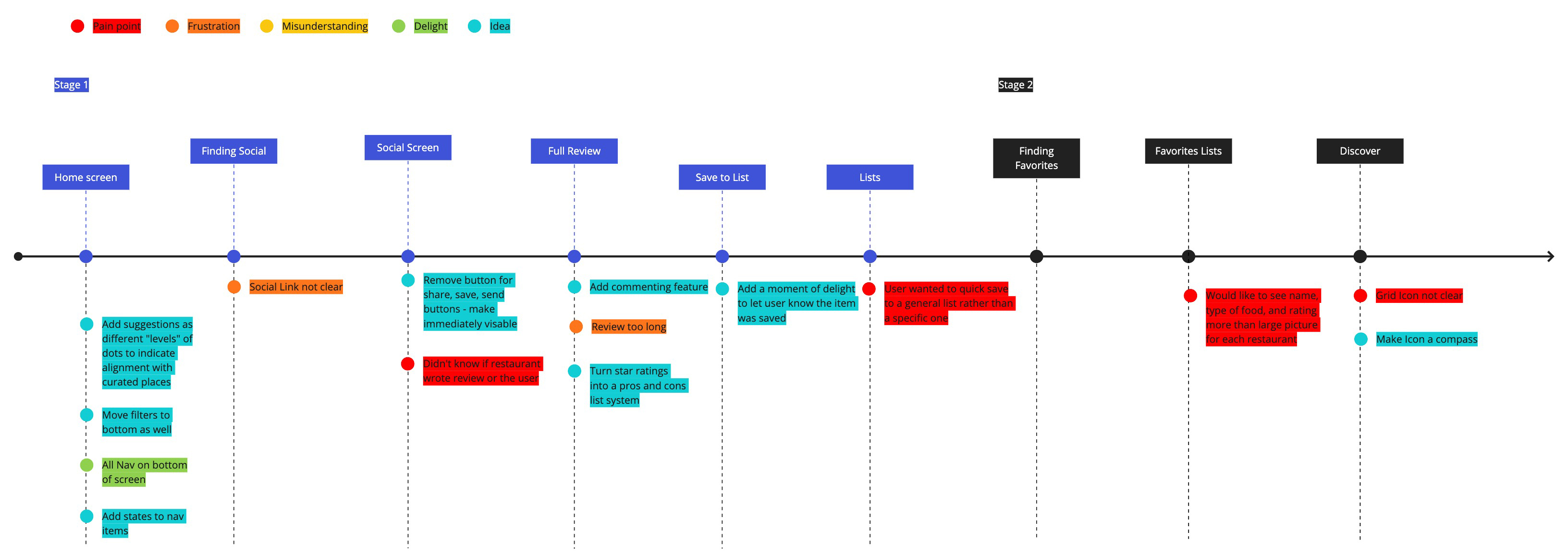
Source of restaurant review was unclear
Quick save option not available, had to specify which list to save to
Emphasis on photos made it difficult to find type of food and restaurant ratings
Use color to differentiate YUM's suggestions from a users saved restaurants
Remove multi-step process to find social icons and make immediately visible
Add a moment of delight to let the user know a restaurant was saved
Inspiration was drawn from fine dining restaurants with a focus on minimal yet functional simplicity. The UI design reflects the user's desire to have a clutter free, curated look and feel.


YUM makes the process of finding a restaurant, saving it for later, and sharing it with friends simple and engaging. It connects people to a social network of fellow foodies and only suggests restaurants that match up with each user's preferences and positively reviewed and rated dining experiences.
Intro screen and onboarding

Users land on the map screen after signing in and when opening the app, making searches quick and easy.
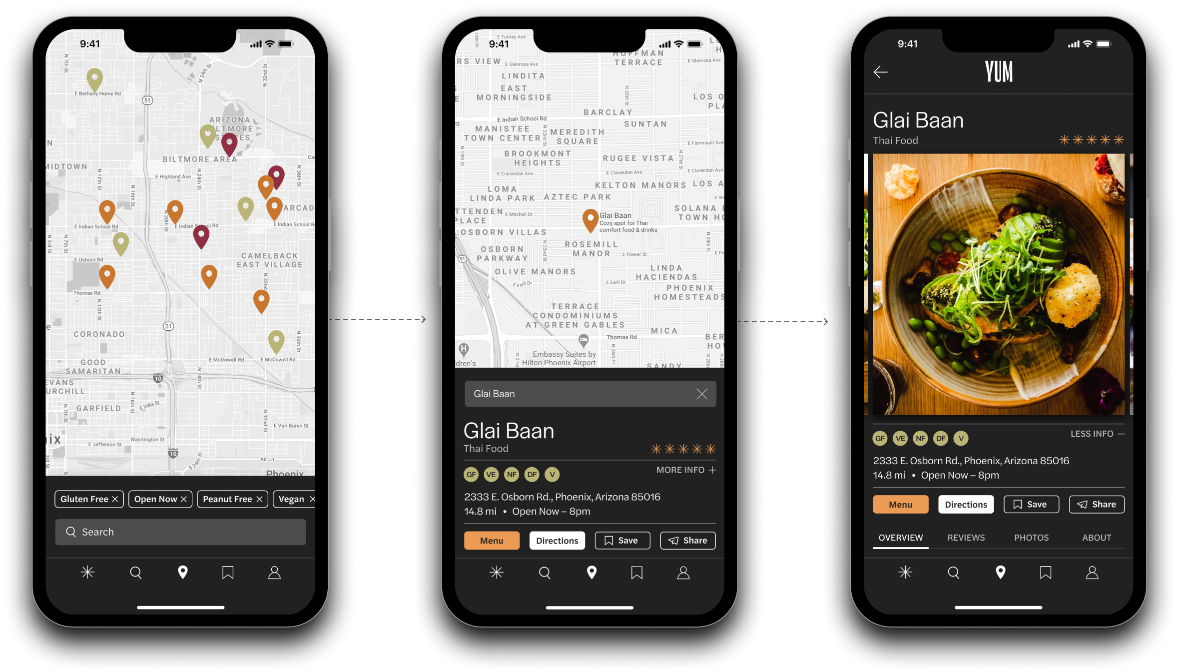
After finding a restaurant, users can then save it and add it to as many lists as they'd like

After saving they can share it with their friends or friend groups

Users can follow friends and read their reviews or write a review and share pictures of their own dining experiences

Profiles feature a recommendation section where users can add their top rated spots

YUM recommends restaurants based on a users location, friends, saved restaurants, and their positive posts and reviews.

Integrates all needs into one streamlined experience
Suggests more personalized restaurant recommendations
Supports social connection and engagement
Saves favorites for quick reference later
Gives users more flexibility to create specialized lists
Provides a source of reputable reviews from trusted friends and influencers

